
Watercolour studies - more pears!
If you have seen my earlier posts (here and here) you can see how my paintings developed, getting simplier!
I also changed the accent colours, choosing from the real ones I would see.


I painted many more, but already sent them as postcards!
At the end I ran out of the ready cut paper - and used some Canson 200 gsm paper for the last pears( as the one above). It dried much faster, and doesn't have the structure of the Fabraiano Artistico coldpressed watercolour paper, but it's also interesting.
Now - it was time to stop!
But I will definitely repeat this painting session as an excercise soon. I also recommend it as a watercolour lesson to everybody: choose a simple subject, paint small size and repeat several times!
It's very meditative and zen - and you learn a lot!
Watercolour studies - pears!
Some days ago I painted a series of pears from my garden (link here).
I started with more naturalistic paintings, but slowly started to simplify.
Below you can get an idea of the process!


More tomorrow!
Painting pears in my garden - so delicious!

Pears, watercolour 10x15 cm
We have had such a hot July, but finally last weekend the temperatures went down a bit, allowing me to move outdoors and enjoy my garden again. I wanted to paint a series of postcards for the postcardartgroup.
The vegetation and flowers have suffered from the heat, but I did find something to paint!

Pears, small watercolours in progress, 10x15 cm
I started to paint the small pears that are maturing right now.
The first paintings were more naturalistic, even if I was using a loose style.
I repeated the same subject several times...

It was very relaxing and meditative to repeat the same subject with small changes, to see which changes would actually improve the painting. or which solutions I'd like more.
Usually I like to paint large, but doing all these studies was possible because I kept the size small, like a postcard - and I highly recommend this excercise to everybody who loves painting!
The postcards are of now, but I'll show you more pictures soon!
Playing with watercolours... Summer colours!

Alcea Rosea, watercolour 24x30cm on Fabriano Artistico 300grs paper
I have either been very busy or very lazy lately, so it's definitely time for a new post!
I painted this hollyhock (Alcea Rosea ) from my fantasy, last week,
when the flowers in my garden were already suffering the heat of July...

And this is what I did first, an underwash just playing with some colours.
To be honest I wasn't really sure what it was going to develop into!
And yes, I admit I was definitely inspired by Jean Haines, if you don't know her work, click on the link for lots of inspiration.

work in progress
Lesson 5: Play with your watercolours!

Take your material and start playing - it's easy and fun!
Start with any piece of watercolour paper and use clean water to wet it with your brush. Check the wetness of the paper by turning it and looking at it from the border : it should be damp all over, without pools!
Now choose 2 or 3 colours and start dropping colours onto the paper! You can mix some colours, if you want, or just let them mix on the paper.

Let the colours spread and see how beautiful the result is without any effort! This is the basics of wet-in-wet painting and You will enjoy playing like this even if you are a more experienced painter!
This is Wet in wet - It's easy!

Wet-in-wet is one of the basic watercolour techniques - so now practice!!

This post will be continued...

Paint what you love! Watercolour Lesson 4

A couple of close-ups of a sketch of my orchids!
When you've managed to get the materials that suit you personally, success is only a few steps away, here's the formula
- Do something you love
- Learn life long
- Repeat steps 1 & 2
I found it here, link to Watercolour Painter, where you can get more information and find step to step instructions as well!

A lot of fun just playing with colours, capturing the pattern and colours of my flowers!
Watercolours allow you to play freely and get fresh sketches more than any other medium!

While this is a more traditional painting from some time ago! Link to my post here.
Painting Endless Summer Nights...

Late evening: Summerhouse in the Archipelago
I'm reposting this painting I made from a photo a while ago.
I kind of feel nostalgic about
Midsummer in the Finnish Archipelago and the long days and sunny nights...
Watercolour Lesson 3: mixing colours!

So let's mix the colours we need! In the last post I said that you only need a few colours to start - actually with 3 basic colours you can easily mix all colours as this triangle above shows.
Just YELLOW, RED and BLUE.
Here I used lemon yellow, alizarin crimson and ultramarin blue.
By varying the quantity of the different colours you vary the tones.
I.e. using more yellow and less blue you get a lighter and brighter green. More blue will give a darker green.
For BROWNS you mix all the 3 colours - but ATTENTION- mixing them in exactly the same proportion might give a dull tone of brown! Excercise by mixing different browns adding more or less of the 3 basic colours.
What about the other colours you have? They will help you to mix different tones: for example the Prussian blue that is a greenish blue will be an excellent base for your greens adding either lemon yellow for spring green or cadmium yellow for moss green.
If you drop some cadmium red - it is a more orange red, i.e. with some yellow in it - into your green you will get beautiful brown shades.
And so on - mix the colours you have, try them on paper and write down the colours you used. This helps you finding your favourite colour combinations.
Mixing your own colours you will learn a lot and you will get vivid and interesting colours, not so flat as ready made colours might be!
Lesson 2: Choosing you watercolours - START PAINTING!
This post was going to be about choosing you watercolours -
but I really think it's more important to START PAINTING whatever colors you have!

Anyway this is also a reminder for who has had lessons with me! If you are going to buy your watercolours, I recommend to start just with a basic box, like the one in the image above. You can also use watercolour in tubes. I suggest starting with these basic colors:
Lemon yellow
Cadmium Yellow
Cadmium Red
Alizarin Crimson
Cobalt Blue
French Ultramarin
Prussian Blue
Yellow Ochra
Burnt Siena
If there's a white pan in the box, put it away - the white is not used in traditional watercolour painting! You only use the white of the paper! (But don't throw it , you can use it for abstract or botanical paintings!)
As you notice, there is no green, purple or orange - because you can mix all the colours you need out of the three basics: yellow, red, blue. If you are not familiar with the mixing of colours, check out this link for the color wheel. The Siena and ochra are additional and good for neutrals or landscape painting as well!
I plan to prepare a post on mixing colours as well, soon.
What else do you need to get started?
- A couple of round brushes - one as large as you dare, and a smaller one -size 12 for example - for the details. They should have a nice point and be capable of holding a full brush load of water (and paint). A synthetic brush will do well for starting.
- 1-2 jars for clean water.
- A plate or palette for mixing colors.
- paper towels
That's all! Now go on painting, mixing and having fun!!
Peony Love - Watercolour painting ready - or not?!

This is my insta photo from some time ago. I never managed to finish the painting, and now I don't know what to do... I need some suggestions from you!!

Now the painting looks like this, and I'm wondering what I should do: leave i this way, or...?
- what do you think!?
(I planned to add some more darks, some spring green to the leafs and stems, work on the water in the glass... and probably do some shadow/background...)
Because the flowers are gone and working from the photo is not so inspiring.
AND the risk is always to overwork a watercolour painting... I'm wandering if I should just leave it the way it is while waiting for new peonies in my garden next year!? Please let me know your opinion!!
Lesson 1: Part Two - Choosing the watercolour paper...

Oranges, watercolour on 300gsm rough paper
So what paper should you use?
A good watercolour paper should be acid free, and contain at least 50 % cotton. Also the weight is important - a 300 gsm (140 lb) is a common choice, and will suite most of your work.
A lighter one (200 gsm/ 90 lb) can be used for sketching, but tends to buckle.
A heavier paper (640 gsm / 300 lb) is fantastic, and you should try it, but it's really not necessary for the works of a beginner or most more advanced painters either. Also the heavier papers tend to absorb more of the pigment, making corrections difficult!

Now you have the choice between the different finishes of the paper!!
Hot pressed is the smoothest surface, it's also great if you want to do an illustration or a more detailed work. A cold pressed paper is a bit less smooth, and the rough paper, as the name tells, has a rough surface, which will add some structure to your painting and will not allow too many finedetails.
Also the finish can contribute to your painting, as you see in the detail above:
the rough paper was the ideal choice for the surface of the orange peel!
I recommend trying different papers - and also different brands.
You can find great paper in blocks, where the paper is glued on the sides and easy to use, especially when travelling or painting outdoors.
Personally I use single sheets. They are larger, can be cut into the size you want, and also it is more priceworthy when you paint a lot. But remember that the sheets have to be taped to a board before painting!
You can read more for example here or here.
You can read more for example here or here.
Lesson 1: The watercolour paper!

GINESTRA - watercolour 50x70cm
It happened again- once in a while I end up using random paper( in this case Canson 200grs paper) instead of real watercolor paper.
The reason usually is because I find it ready to hand, just in the right size - and I just plan to do a fast sketch anyway ;).
But now, what happens when your sketch didn't turn out that bad, BUT you can't finish it...
Good watercolor paper is GOOD because it can take several layers of color and water. In this painting I feel like it would need some more depth and shadows using wet color - but this paper can't take it -I could draw on it , or paint with a very dry color - but that's not what I want!
On the other hand I don't really want to paint this subject again, even if I often do paint more versions, since I feel quite happy with the way I captured the esssence I was looking for!
And also the flowers are on the compost now!!
So remember one of the very first lessons - ALWAYS use GOOD watercolor paper!!
Wisteria Love! Reworking an old painting!

I just love the wisteria and would love to sit on that bench!
This painting is made from a very small photo, I think it was a pubblicity in a garden magazine, a few years ago.
I wasn't happy with it, but left it in the pile. Then recently I found it again and got inspired!
I washed away part of it, and painted the shadows on the wisteria
(and some yellow for the light on the ground -even if the photo doesn't show it!).
I would have liked more white, but it's not possible now. If I can find the original photo again, I will try to do a new version though!
Do you ever rework old paintings?!
Finished work!

This is the finished watercolor painting from last week. As I wanted to keep it loose, I just added some red on the flowers, and a few darker shadows on the leaves.
Visiting Giardino Corsini

This weekend I visited the beautiful garden of Palazzo Corsini al Prato in Florence. During the show Artigianato e Palazzo, many artisans and artist exposed there products and artworks in the garden and in the three 'limonaia' - the greenhouses for the lemon trees in the winter.
My main interest was the guided tour to the garden by a historian and also learning about the more botanical and practical aspects by Paolo, the gardener.

In the parterres there were beautiful scented peonies, artichokes, lavender and santolina
- no close ups, sorry!

But I also enjoyed the beautiful portraits by Magali de Maistre , Sicilian 'cannoli' and much more!
I wasn't planning to show the photos, so I just took a few for my own records, but you can search
'Palazzo Corsini al Prato' for more photos!
Work in progress - A Tribute to...
Work in progress... Inspired by a beautiful painting of the great watercolor artist Kanta Harusaki.

The First washes, wet in wet.

I decided to add some red to the center of the flower and some plastic wrap for special effects...
I'll show you the final painting soon - I just noticed I didn't take a photo of it yet!
I decided to 'copy' freely the works and the styles of some artists I like, in order to develop my own way of painting. Especially I want to loosen up. I never liked copying artwork before, but noticed that this was a funny way of just painting without worrying about problems to resolve, like composition and choice of color! I really think that I'll be doing more of this!!
Floral - just sketching!

I often use my sketchbooks for playing around and painting early in the morning
- even when I don't have time ! And yes, often it is floral!
Hibiscus - floral watercolor

I took a reference picture of this blue pot with a yellow hibiscus, that I wanted to paint .
I really enjoyed the painting session with bright colors - and I chose to add red for more contrast - as the original flowers were onlyt yellow . Unfortunately the photo doesn't show the intense yellow - looked ok on my phone but not on the pc!
Sketching Cypresses!

A picture from my smaller sketchbook from last week!
Just playing around with colors and a common object -cypruses!
Painting challenge!

It's time to show my ltest participation in the painting challenge by paintanddrawtogether.blogspot :
the entrance to Ottawa Parliament Building (click on the link for the reference picture).
This time I was quite happy with the colors (that I deliberately exagerated a little!), the light and the layers - but Oh! again: how hard isn't it to get a decent photo of your painting!?

A detail.

As so often, even now I did a few attempts!
Watercolor landscape workshop!
.jpg)
I had a lovely weekend recently, painting in good company and experimenting new technics, participating at a workshop by the Swedish artist Björn Bernström. It was very inspiring and liberating with new approaches, and especially fun to look for special effects - like 'cauliflowers' - that traditionally are considered errors!

Here, as in the first picture, we were using burnt umber creating staining effects...

A more traditional painting, or actually two in one!!
Exploring wet-in-wet and new colors, more than aiming for finished paintings.


They look better separated!
Here the transparent and delicate colors show a little better...
Mixed Media Sketching Tuesday!

Last week I had a wonderful afternoon, drinking tea and sketching and painting with my friends!
I was supposed to stop by just for a while, and didn't bring much material with me, only and old book and some white gouache. While chatting and sipping on the tea, I started to partially cover the book pages with the white paint... I really didn't have any idea of what I was going to do...

Since I didn't have any watercolors with me I then used the different teas on the paper for some abstract designs for warming up, and finished with some watercolor pencils...


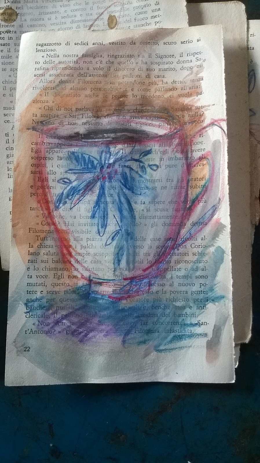
Now I was inspired enough to end up with some small and loose mixed media sketches of coffee and tea cups! I really enjoyed improvisating and sketching in good company, and I was quite happy with the result as well, even if these are no traditional watercolor paintings - what do you think?!
Subscribe to:
Posts (Atom)